

At a glance: A self-initiated identity for a proposed new name for Cleveland’s baseball team. It started as a single logo in 2016 and, after unexpectedly going viral, grew into a full identity system in 2020: logo, wordmark, uniforms, animation, apparel and social graphics.
Role: Creative Director and Designer
Case Study
In 2016, I set out to answer a simple question: What could Cleveland’s baseball team be called instead? What began as a self-initiated logo exploration became an unexpected exercise in brand strategy, history, and the power of design to change perceptions. The Cleveland Spiders identity was rooted in a name from the city’s baseball past, but designed for the Cleveland of today: a city rebuilding its identity, its pride, and its sense of possibility. Four years after I first published the logo, an unexpected wave of attention led me to turn that single mark into a complete identity system and gave me the opportunity to explore what a modern Cleveland baseball brand could look like, feel, and mean.
The situation
In October 2016, Cleveland’s baseball team made it to the World Series. For a lot of fans, me included, that joy came with a catch: we loved the team, but we couldn’t comfortably wear its logo or defend its name. Plenty of people knew the old identity had to go. Nobody was offering a credible alternative, so I set out to make one, with one core belief: Good design can change hearts and minds.
What the research turned up
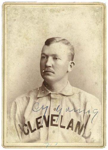 Cleveland had a rich history as a baseball city, and the primary team had gone through many names in their early years. One in particular stood out as unique in MLB history and certainly memorable: The Cleveland Spiders.
The Spiders took their name in 1889 from their black-and-gray uniforms and the skinny, long-limbed look of many of their players. They were the city’s first major league team. Cy Young pitched for them, and the 1895 team won the Temple Cup, an early forerunner of the World Series. This was Cleveland’s first major sports championship.
Then came the part that made me take it personally. In 1899, the team’s owners, who also owned a club in St. Louis, moved Cleveland’s best players there, Cy Young among them, and left the Spiders with whatever was left. They finished 20–134, the worst single-season record in baseball history. The team wasn’t beaten so much as stripped for parts by people who had decided its talent was worth more somewhere else.
As a Clevelander, that’s a familiar story. Cleveland, at the turn of the twentieth century, was one of the great boomtowns of America. Standard Oil began here, Euclid Avenue was lined with some of the biggest fortunes in the country, and by 1920 it was the nation’s fifth-largest city. Then the steel, the factories, the jobs, and eventually the people went elsewhere. By 1978 the city had defaulted on its debts, and the river at the heart of its industry had become a national joke for catching fire. The city that had been a shining jewel became the “Mistake on the Lake,” a rust belt shell of what it once was.
By 2016 Cleveland was coming back. The Cavaliers had just won a championship, the baseball team was headed to the World Series, and downtown was filling up again. A city that had been stripped for parts was rebuilding. Bringing back the name wouldn’t just revive a team that had been unfairly dismantled and ridiculed. It would say that Cleveland remembers what it was, what was taken, and believed that we could rebuild.
The idea
Bring back something that was taken from the city. Reclaim the name Cleveland Spiders and the championship history that came with it. Craft an identity that fans could embrace without asking them to start over.
The mark
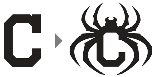 If the name was a return to one golden era, the mark needed to feel like a continuation of the current one. The red, blue and white that fans already carried, and the Block C they already wore. The solution was almost embarrassingly simple, which is why I trusted it: add eight legs to the Block C. The angular silhouette was immediately recognizable, with the legs of an arachnid curling around it. It took many rounds of variations to get the proportions and the silhouette right, but when I got there, I knew I’d – forgive me – hit a home run.
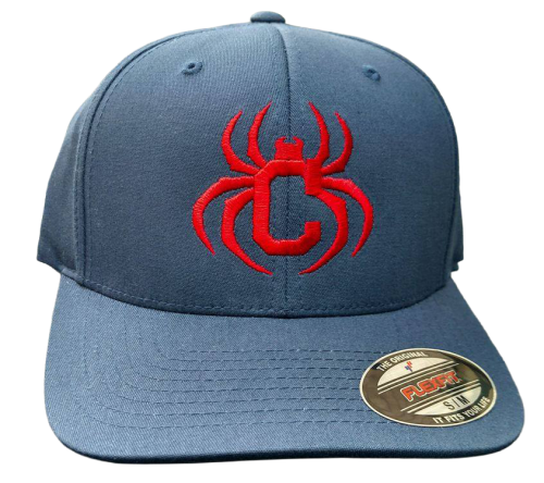 I shared the logo in 2016 under a Creative Commons license, screen-printed shirts myself in my laundry room, and shipped them around the country at cost to anyone who wanted one. As it spread organically among progressive Cleveland baseball fans, the strength of the mark began to emerge. A friend had a one-off cap made years before the identity took off, and it looked like it should be for sale in the team shop at the corner of Carnegie & Ontario.
2020: Unexpected virality
In the summer of 2020, as the team signaled they were considering moving on from a racist past, debate over the team’s name went national. Much to my surprise, the Spider C started appearing all over social media. My 2016 blog post had been indexed by Google as “Cleveland Spiders Logo,” and it was showing up in search results. People who found it assumed it was the original team logo and started sharing it on their own. That told me the mark was doing its job: it felt familiar enough to read as the real thing.
It also told me there was demand for something that didn’t exist yet. People wanted the name, and they wanted a brand to go with it.
Building the system
I built the identity out in public, sharing each piece on social media as I went. I started with caps, then added a wordmark, a full uniform design, an animated logo, masks, shirts and social graphics. Each piece applied the same idea: Cleveland’s own history, carried in colorways and design elements fans already knew.

The outcome
The apparel line raised thousands of dollars for the Lake Erie Native American Council and First Nations Development Institute, as half of profits went to these organizations.
The project also moved the conversation. A frequent comment on social media was some version of “I’m not a big fan of changing the name, but I’d wear that!” For someone who was ambivalent, a good identity made the change something they could picture and not just something happening to them. The project was featured in the New York Times and on ESPN.com. The team ultimately chose a different name, but the Cleveland Spiders project showed what a credible, fan-ready alternative could look like, while giving back to the Indigenous communities the former name and mascot had profited from.
I started with the idea that good design can change hearts and minds. Nobody was argued into backing the Spiders identity. They were shown something they’d be proud to wear, and they embraced it.
Featured Gallery: