At a glance:
Brand refresh for a boutique investment firm. Included an in-depth brand discovery process, market positioning, creation of a new logo, tagline development, brand guidelines, and website redesign.
Project Role:
Creative Director
Case Study
CapSol was preparing to answer a simple question: What should a modern investment firm look like? A project that was initially begun as a simple logo and website refresh became an exercise in defining what made CapSol different from a transactional funding source: its commitment to long-term partnerships, thoughtful guidance, and the people behind the businesses it invests in. The new identity was designed to bring those qualities to life, balancing the credibility and experience expected of an investment firm with a warmer, more human sense of optimism and possibility. The result was a new brand positioned not simply around providing capital, but around helping entrepreneurs turn bold ideas into thriving businesses.
The Client
 CapSol is a boutique investment firm focused on helping early-stage entrepreneurs turn promising ideas into sustainable businesses. But its role extends beyond providing capital. Alongside funding, CapSol offers strategic guidance, operational support, and long-term planning, working alongside entrepreneurs as their businesses evolve.
The company is intentionally selective about the businesses it works with. Its ideal clients are entrepreneurs with strong ideas, drive, and integrity who recognize that building a successful business requires more than money. CapSol’s goal is to provide the capital, guidance, and tools they need to focus on what they do best while building a foundation for long-term growth.
That makes the company less like a traditional lender and more like a long-term partner: experienced enough to provide perspective, but close enough to the business to understand the people behind it.
The Research
The first step was understanding what CapSol actually offered beyond capital.
CapSol is a boutique investment firm, but its role goes well beyond providing funding. The company offers guidance, operational support, strategic insight, and long-term planning alongside its investment. Rather than simply supplying money and waiting for a return, CapSol wanted to work alongside founders as they built and grew their businesses.
That distinction became the foundation of the brand strategy. CapSol wasn’t trying to compete by being the loudest, most aggressive, or most sophisticated-looking investment firm in the room. Its opportunity was to be the experienced partner who could bring clarity to the uncertainty of building a business. The manifesto described this as being “the wise, grounded advisor in a sea of overhyped voices.”
Its ideal audience was early-stage entrepreneurs with strong ideas, drive, and a willingness to collaborate, but who recognized that they needed more than capital to turn those ideas into sustainable businesses. CapSol was intentionally not positioned as a quick or transactional source of funding. It was looking for entrepreneurs who wanted a partner for the long term.
The manifesto distilled that philosophy into a simple idea: CapSol invests in the people behind the business, not just the business itself. That became the central insight for the rebrand, shaping both the positioning and the visual identity that followed.
“Turning Bold Ideas into Thriving Businesses” became CapSol’s brand promise. It speaks to both sides of the relationship: the ambition of the entrepreneurs CapSol works with and the experience, guidance, and support it provides to help turn that ambition into something sustainable.
“Investment with Integrity” became the company’s positioning statement. It emphasizes the human element of the relationship and distinguishes CapSol from funding sources that prioritize short-term returns or rigid, transactional relationships.
Together, these ideas established a clear personality for the brand: experienced without being condescending, confident without being flashy, and sophisticated without losing its humanity.
The goal was to position CapSol as the wise, grounded advisor in a sea of overhyped voices. A partner who has seen the road before, but is still genuinely excited about where a new business might go.
The identity
 When developing the visual identity, one phrase that came out of the discovery process kept coming up:
“We Grow With You”.
We needed to make that positioning immediately apparent.
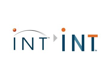
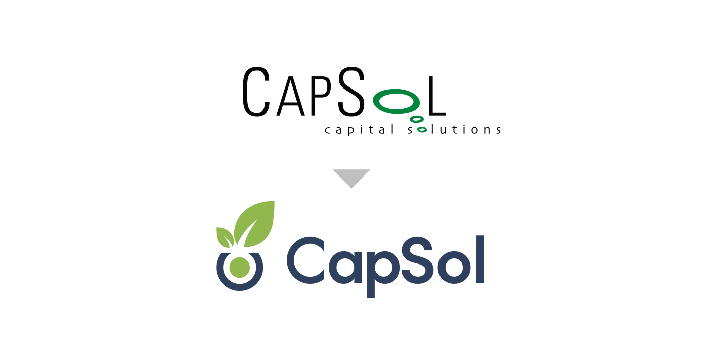
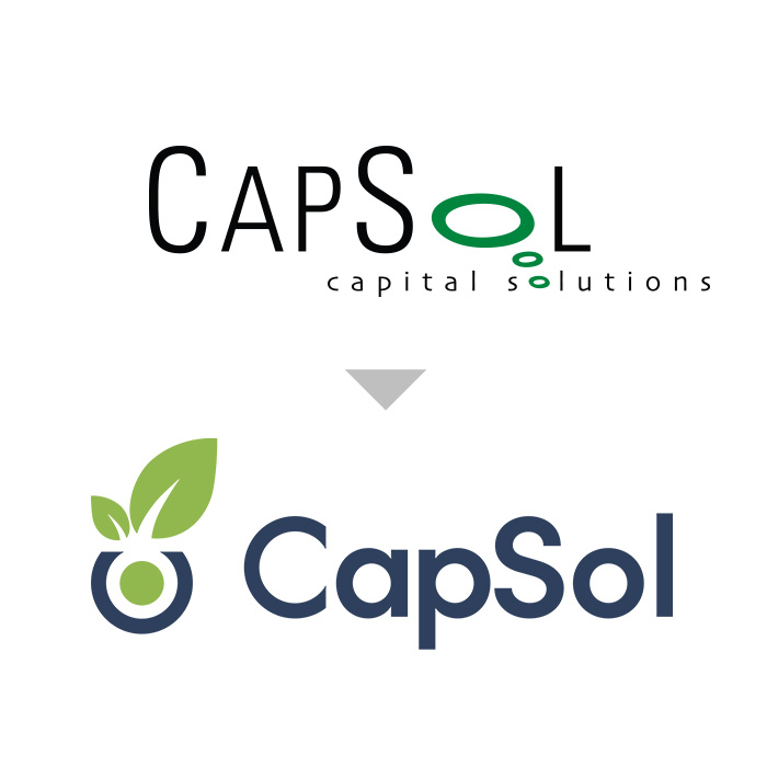
The previous CapSol logo relied on a dated typographic treatment and a poorly integrated green-and-black symbol. The new identity takes a more unified approach, combining the company’s name with a new symbol that communicates growth, potential, and partnership.
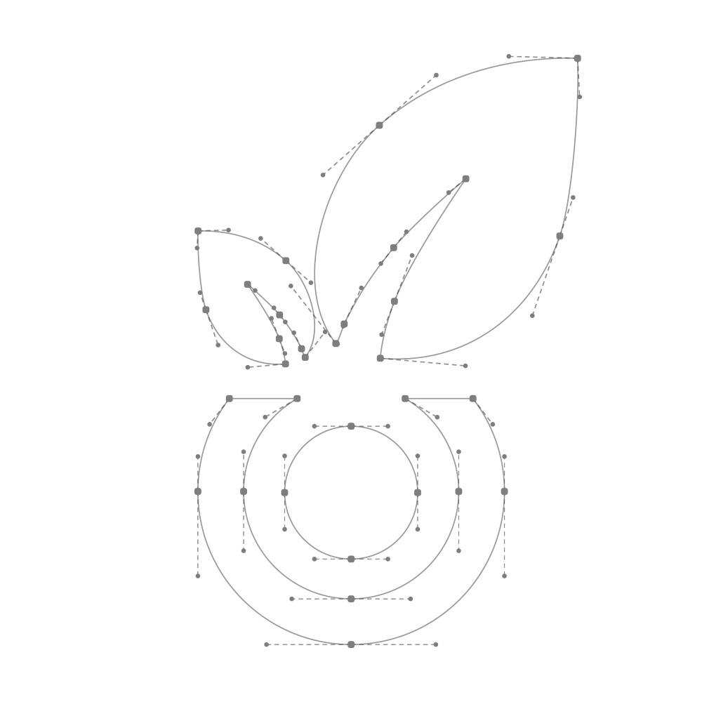
The new symbol is built from a series of carefully integraged nested elements, creating a simple form that can hold several meanings at once.
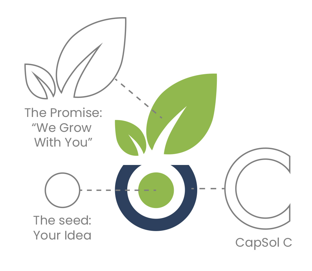 At its center is the seed: an idea with the potential to become something larger. The surrounding form incorporates the shape of CapSol’s C, forming a protective container around the seed. The leaves emerging from this capsule represent growth, in a visual expression of the brand’s promise to help turn an idea into a thriving business.
The result is a mark that tells the same story as the positioning: an idea, supported and nurtured, becoming something bigger.
The identity also needed to feel established enough to communicate financial expertise without falling into the visual conventions of traditional investment firms. The new mark and accompanying wordmark provide a cleaner, more contemporary foundation while retaining a sense of warmth and optimism.
The visual system
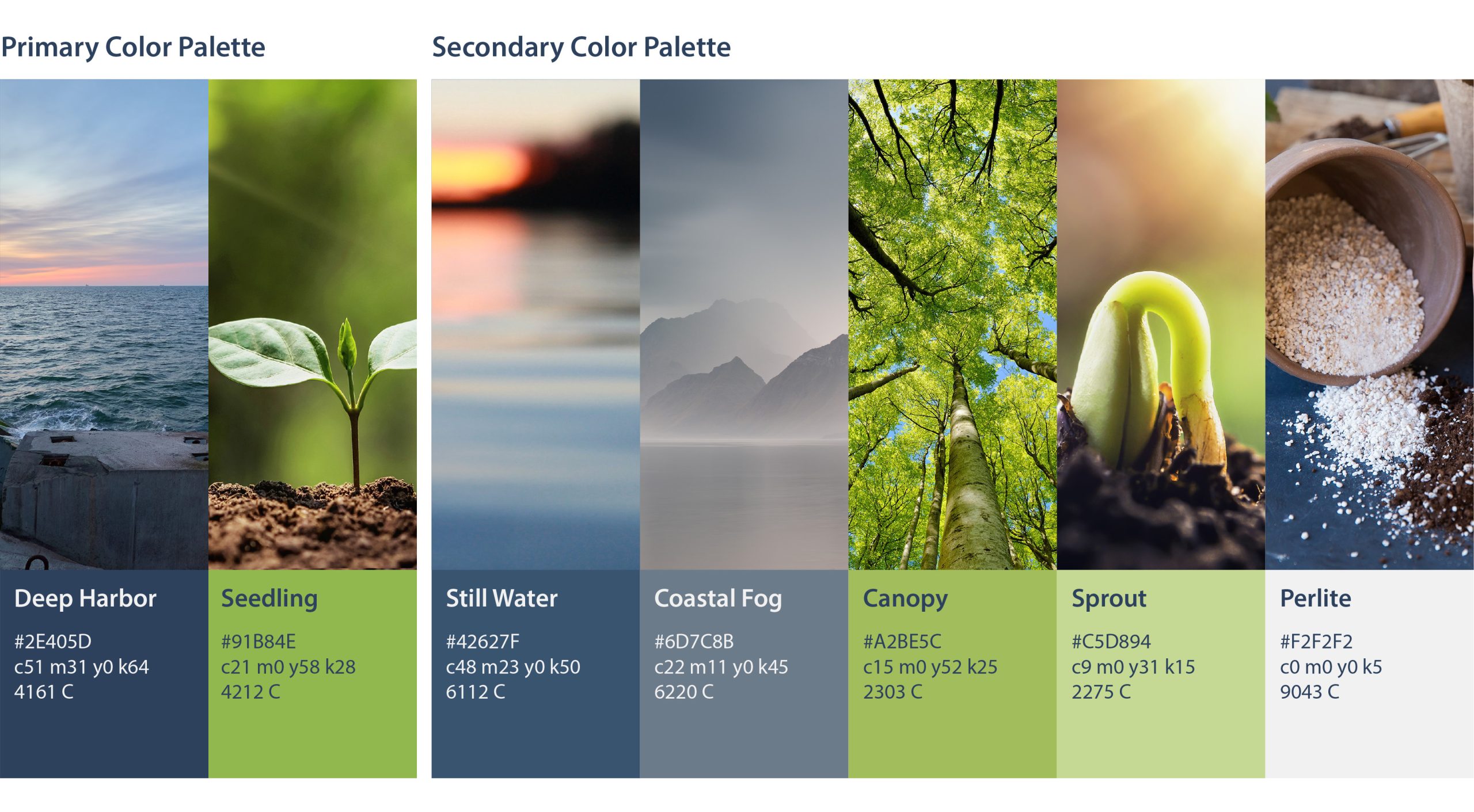
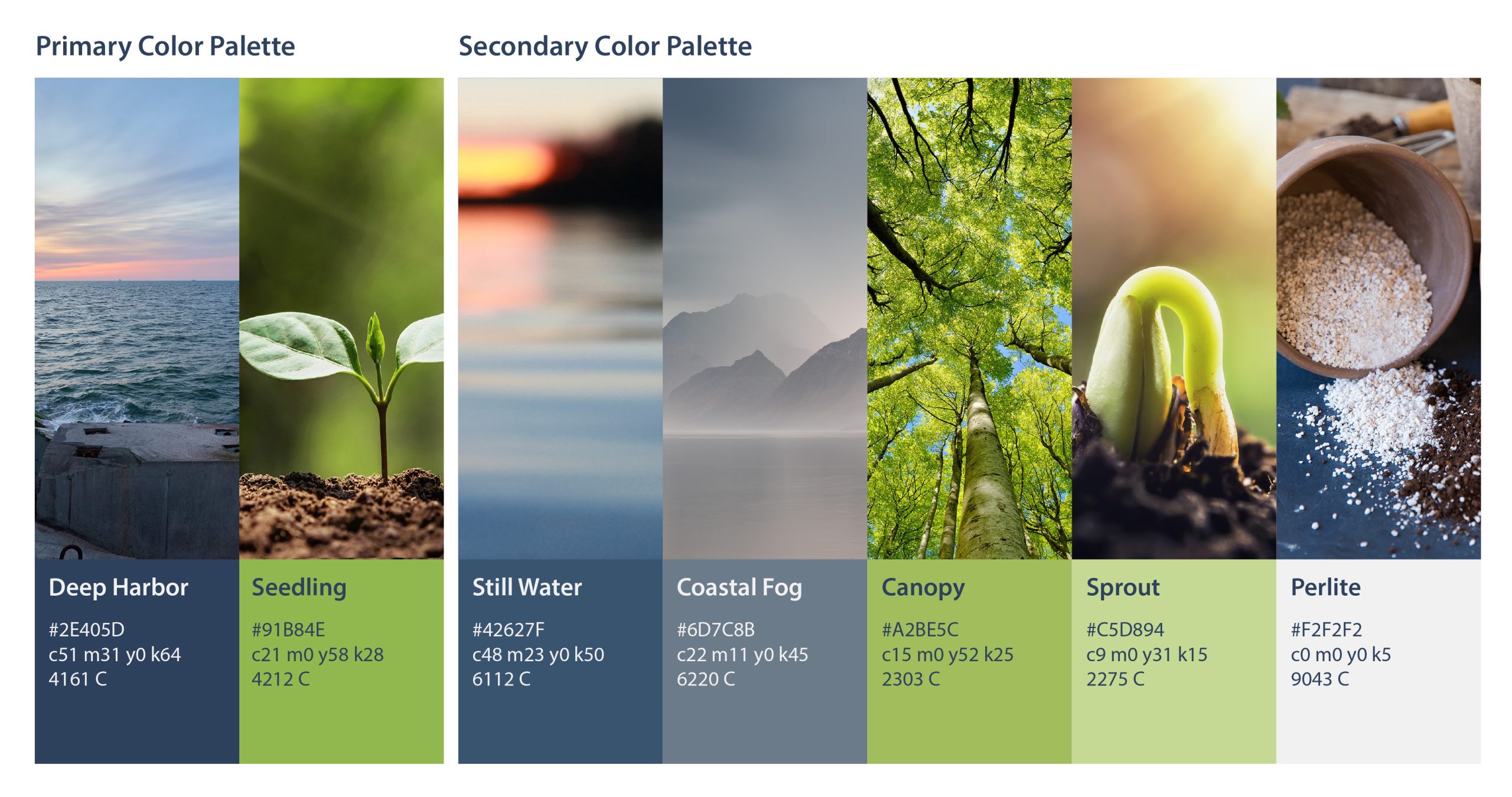
The color palette reinforces the balance between experience and growth. We chose colors that evoke the security and possibility of an ocean bay, and the energy of plant growth.
Deep Harbor, a dark navy, provides the foundation of the system. It communicates stability, trust, and confidence, giving the brand the weight expected from an investment firm.
Seedling, a spring green, introduces the sense of growth and possibility that sits at the heart of CapSol’s positioning. Secondary colors including Still Water, Coastal Fog, Canopy, and Perlite expand the palette into a more flexible system while maintaining the calm, grounded character of the brand.
The result is a palette that feels financial without feeling institutional, and optimistic without becoming overly youthful.
The website
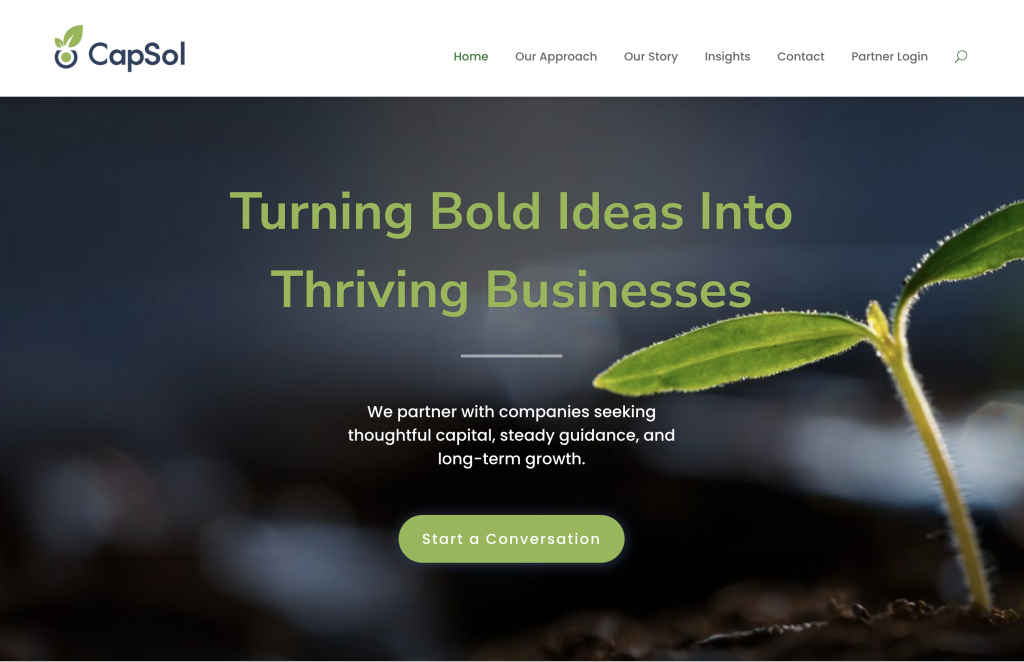 The website was redesigned as the primary expression of the new brand and positioning.
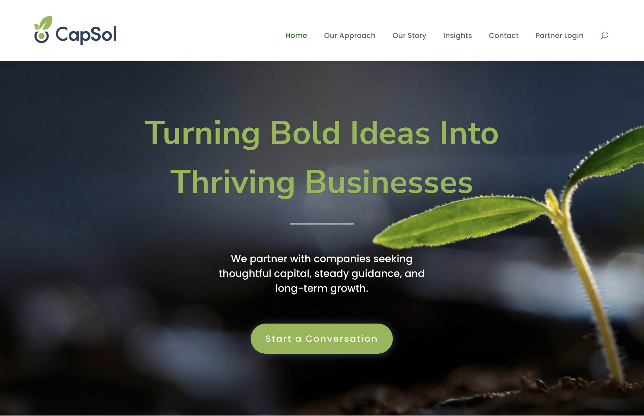
Rather than leading with financial-services language, the new site puts CapSol’s relationship with entrepreneurs at the center. The messaging focuses on thoughtful capital, steady guidance, and long-term growth, reinforcing the idea that CapSol’s value extends beyond the money it provides.
The visual language carries the new identity throughout the experience, using the deep navy and green palette alongside photography centered on growth, potential, and the process of building something from the ground up.
The homepage leads with the brand promise, “Turning Bold Ideas Into Thriving Businesses,” followed by a straightforward explanation of the relationship CapSol wants to build: partnering with companies seeking thoughtful capital, steady guidance, and long-term growth.
The result is a website that feels less like a traditional investment firm and more like the kind of partner the new positioning describes.
The outcome
The rebrand launched shortly before this case study was written, so it is too early to make meaningful claims about new investments, leads, or business growth.
Instead, the immediate outcome is one of positioning.
CapSol now has a contemporary identity and digital presence that more accurately communicates the company it wants to be and the entrepreneurs it wants to attract. The new brand moves the company away from the dated visual language of its previous identity and gives it a clearer, more differentiated position in the market.
Most importantly, the rebrand gives CapSol a visual and verbal foundation for its next stage: not simply providing capital, but helping ambitious people turn bold ideas into thriving businesses.
As the Brand Manifesto puts it, CapSol doesn’t measure its success by how quickly it gets paid back. It measures it by how far its clients are able to go.
Featured Gallery: