At a Glance:
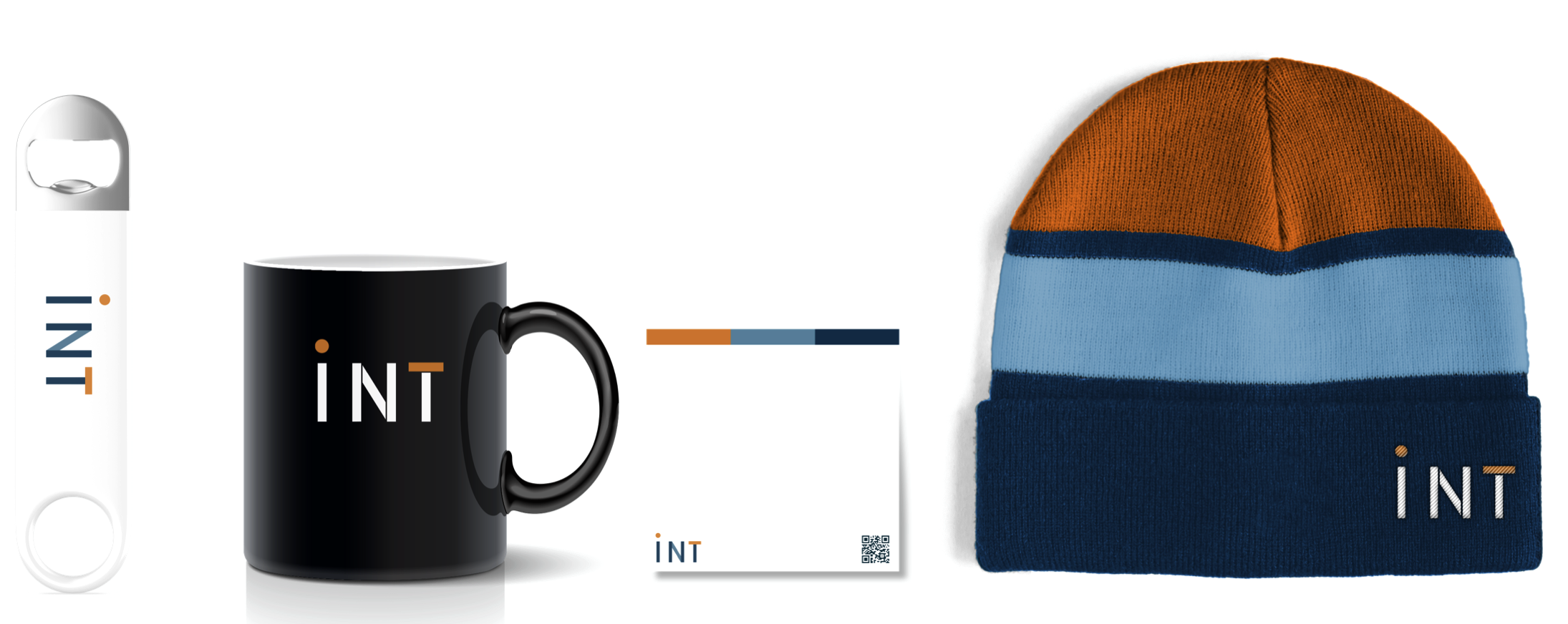
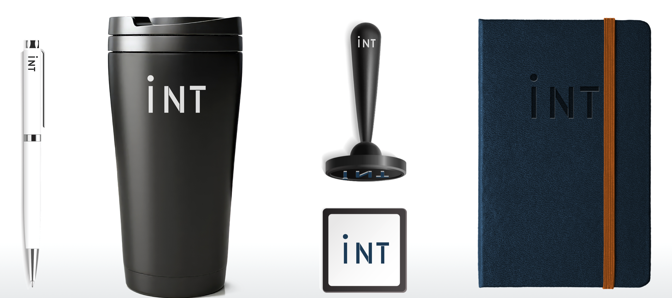
Brand refresh for a Managed Services provider. Included an in-depth brand discovery process, market positioning, creation of a new logo, tagline development, brand guidelines, image formats, swag design, website redesign, virtual backgrounds for video calls, motion graphics, and 1-pagers.
Project Role:
Creative Director
Case Study
INT took on a full rebrand to modernize their visual identity, website, and communication strategy. Their aim? To make sure their brand kept pace with their evolving values and client-first approach. They wanted to strike the right balance between a professional yet playful tone, and the reliability and trustworthiness their clients count on. Ultimately, this rebrand was about strengthening their market presence and unifying their identity across all platforms, gearing them up for future growth and deeper client connections.
How Do You Rebrand a Company from the Inside Out?
A rebrand or brand refresh is always a complex project, regardless of the client. Generally, when I think of a brand, I think of two things: First, a company’s “voice”, which includes their tone of communication and style of language. Second, a company’s “face”, which includes their name, logo, typography, iconography, color scheme, and other ways the company is represented visually. These are the end result of a rebrand or refresh. To get there, though, I believe it’s necessary to have a deep understanding of the company in question: where they came from, where they’re going, what makes them different than their competitors, and who their ideal customer is.
You might think that working at a company would make it easier to answer these questions, but that’s rarely the case. Any easy way to think about it is – if you only ever saw the inside of a house, could you easily describe the exterior? You’d know the layout of the rooms and their purpose, but do you know how it looks to a stranger on the street?
With that in mind, I decided to approach INT’s brand refresh as if the company were a client, not an employer. I started with the biggest questions: What is INT, and what do they do?
The Client:
 INT Inc. is headquartered in Lincolnshire, IL with a diverse and talented team of professionals located across the country. From technology management to web design and accounting to cybersecurity, their innovative solutions address a variety of business needs for small and medium businesses. Their success comes from listening to their customers’ unique challenges and needs, developing effective strategies, and implementing innovative solutions.
The Problem:
As INT planned for growth, it became clear that their existing brand identity no longer fully captured their client-first philosophy and playful, approachable tone. They needed an updated brand that better represented their values and set them apart in a crowded market. Additionally, their website was due for a refresh, as it lacked the modernity and functionality needed for clear, effective communication with clients. Ultimately, the goal was to build a cohesive and engaging brand identity that would resonate with clients while maintaining a professional, dependable image.
The Challenges:
Prior to starting the rebrand, I predicted several key challenges that required careful consideration and strategic thinking to navigate effectively:
- Maintaining Objectivity: Working “inside the house” made it challenging to step back and view the brand through an impartial lens. This closeness risked blinding me to potential weaknesses in their existing identity and made it harder to make unbiased decisions about what should change and what should stay.
- Securing Leadership Buy-In: A rebrand is a significant undertaking that affects every aspect of a business, so I needed strong buy-in from leadership to move forward effectively. This was challenging because, beyond showing the long-term benefits, I had to address any concerns about the disruption a rebrand might cause to existing processes and perceptions.
- Identifying and Preserving Brand Equity: I recognized that certain elements of INT’s brand held significant value with their audience. However, distinguishing between what was core to their identity and what was outdated or limiting was complex. The challenge was to evolve the brand in a way that honored INT’s legacy while still making a bold statement about their growth and future direction.
The Research:
Before developing the new identity, I needed to understand what INT actually stood for beneath the collection of services it provided. After several discovery sessions with company leadership, I developed a brand manifesto that became the foundation for the work to come, helping distill INT’s strengths, personality, audience, and existing brand equity into a clearer strategic direction.
A Partner, Not Just a Provider
At its core, INT’s differentiator was its approach to client relationships. “Our Purpose is Your Business” captured the idea that INT’s role extended beyond delivering individual services. The company wanted to understand each client’s business, identify the right solutions, and become a trusted partner in helping them succeed. The goal was not simply to get things done quickly, but to find thoughtful, lasting solutions and build relationships along the way.
Reliability Without the Corporate Posturing
INT’s positioning, “Business Solutions You CAN Take for Granted,” provided an important counterpoint to the typical language of the technology industry. Reliability and consistency were central to the value proposition, but the intentionally wry phrasing gave INT permission to communicate those qualities with a sense of humor rather than resorting to the usual corporate promises.
The Right Clients, Not Every Client
The research also clarified who INT was (and wasn’t!) for. INT’s ideal customers were small and medium-sized businesses whose teams lacked the time or expertise to manage every aspect of their technology and operations themselves. Just as importantly, the best client relationships shared INT’s values: positive energy, collaboration, and a willingness to work together toward the right solution. This meant positioning INT as a partner for businesses that valued relationships and expertise, rather than simply as another vendor.
Professional, Human, and a Little Self-Aware
This understanding ultimately defined INT’s personality. The brand needed to project confidence and expertise without becoming stiff or overly corporate. Its voice was intentionally defined as “understated & self-deprecating, yet confident”: concise, conversational, positive, and occasionally playful. INT took its clients’ businesses seriously, but didn’t need to take itself quite so seriously.
The research also identified elements of the existing identity worth preserving. The distinctive orange dot in the logo and the navy, orange, and light-blue color palette already had recognition and personality. Rather than discard that equity, the opportunity was to refine and modernize it while giving those elements a more intentional role in the new brand system.
Together, these findings established the strategic direction for the refresh: INT should feel dependable without being boring, knowledgeable without being pretentious, and professional without losing its humanity. The visual identity and communication system needed to make those qualities tangible.
The Solution:
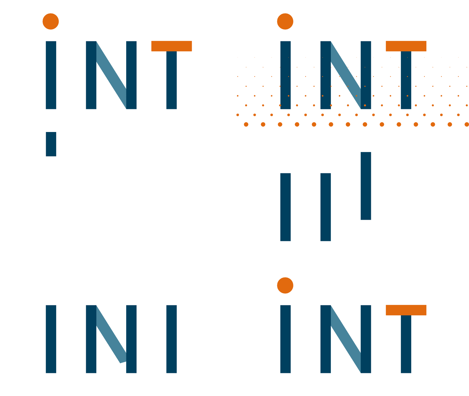
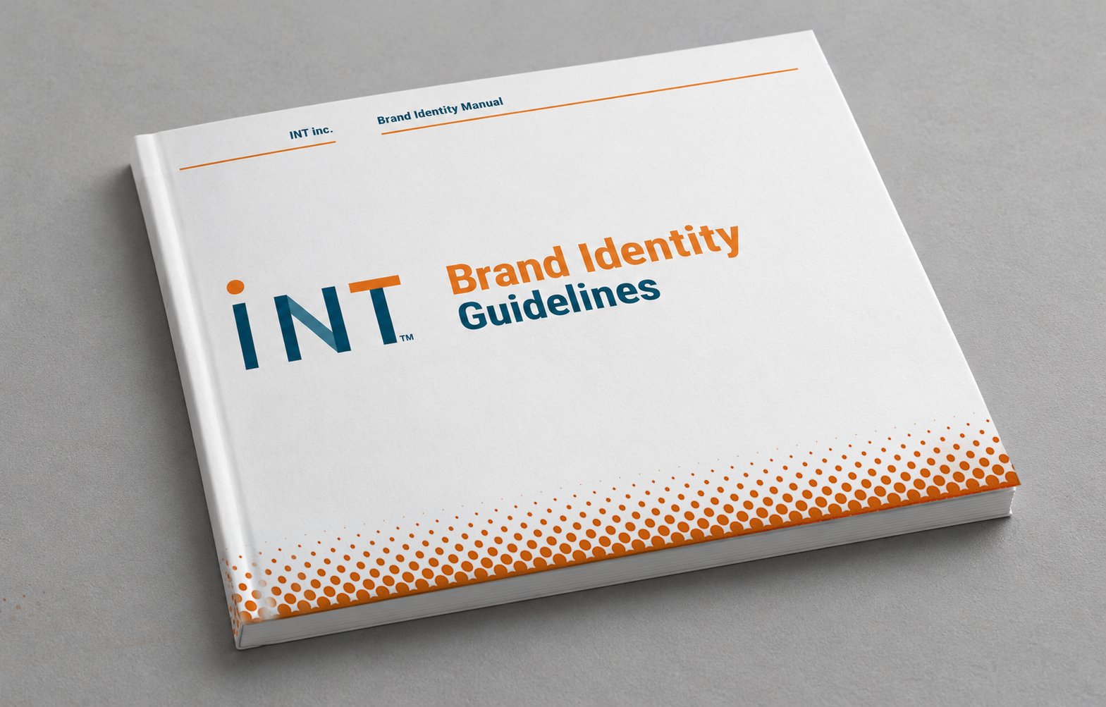
INT’s rebrand was anchored in the development of a comprehensive brand identity guidelines book, alongside a new logo and a complete website refresh. The rebranding process followed several key steps:
- Defining INT’s Tone of Voice & Tagline: During the rebrand, I defined the company’s tone of voice and created a new tagline and positioning statement:
- Tone of Voice: A blend of professionalism with humor and relatability, ensuring communications felt human and approachable.
- Tagline: “Our Purpose is Your Business,” which emphasizes their focus on client partnerships.
- Positioning Statement: “Business Solutions You CAN Take for Granted,” which highlights their reliability.
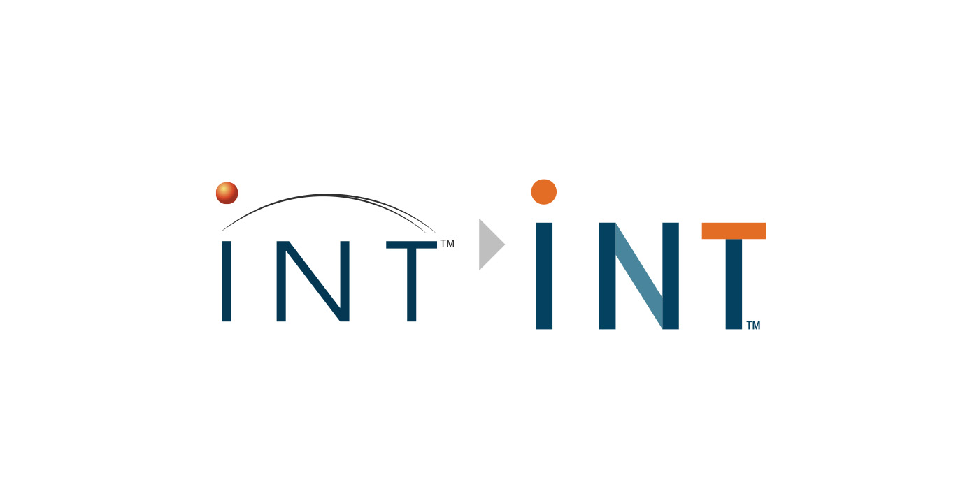
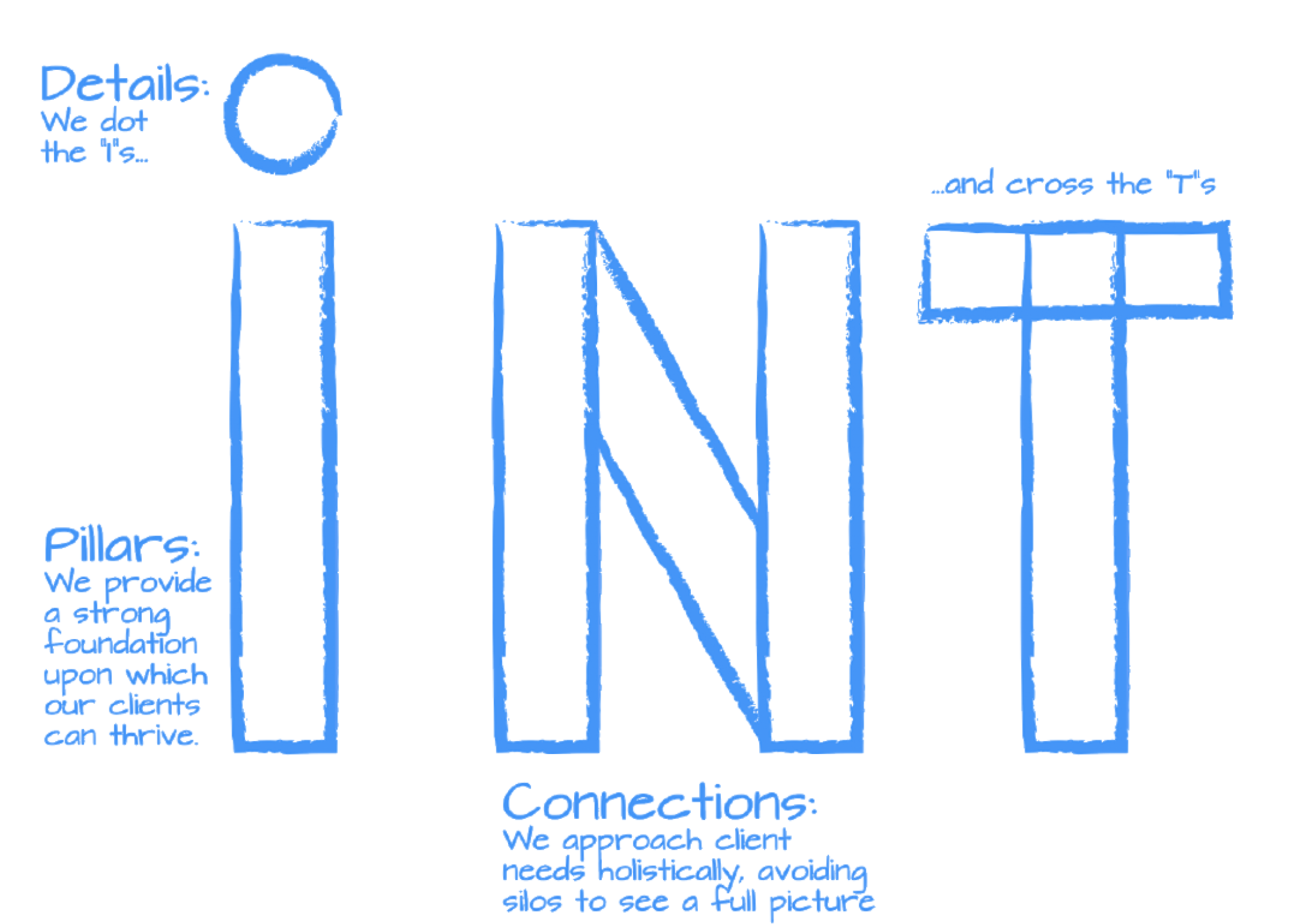
- Creating a New Logo: INT’s new logo embodies its values:
- Strong Foundation: The vertical pillars of each letter represent the strong foundation of support that they provide their clients.
- Holistic Approach: The connecting bar between the two pillars in the “N” symbolizes how they make the connections needed to provide a holistic approach to addressing client needs.
- Attention to Detail: Their attention to detail is reflected in the orange pop of the dotted “I” and crossed “T.”
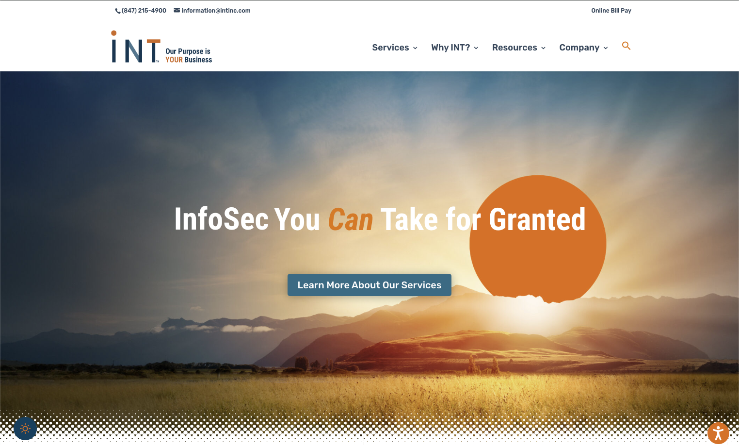
- Website Redesign: The website was revamped to ensure better functionality and a modern aesthetic. Key features included:
- Improved Navigation: Simplified and streamlined for ease of use.
- Brand Consistency: Visual elements from the brand guidelines were incorporated, such as the signature orange dot and halftone patterns.
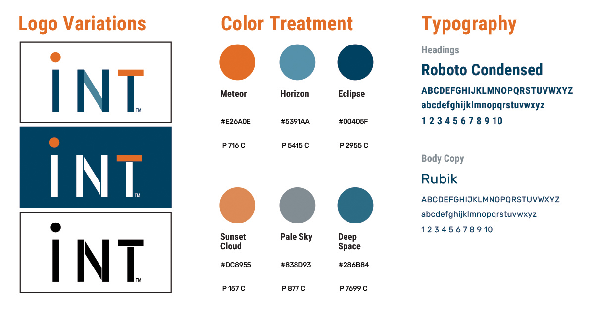
- Modern Visuals: Use of new brand colors like “Eclipse” and “Cloudburst” to create a clean, contemporary look.
The Outcome:
The most lasting result of the rebrand isn’t how INT looks, but instead how easily INT can look like itself.
The brand guidelines codified how INT shows up in the world: its voice, color, typography, and signature orange dot. Alongside them, a set of document, one-pager, and image templates turned those concepts into tools anyone at the company could build with. Employees outside the Creative department can now produce on-brand promotional pieces, social media graphics, email newsletters, PowerPoint presentations, and proposal documents on their own, without a designer in the loop for every piece.
Why does that matter? Because I’d uncovered that INT’s core promise to its customers was “Business Solutions You CAN Take for Granted,” and when your brand is built on reliability, it has to look reliable everywhere, not just on its website.
Featured Gallery: